CLIENT:
SEATTLE
KRAKEN
Roles:
• Illustration
• Custom Typography
• Poster Design
• Animation
• Campaign Assets
Creative Direction:
51 Eggs Branding
PROJECT:
Reverse Retro Poster Campaign
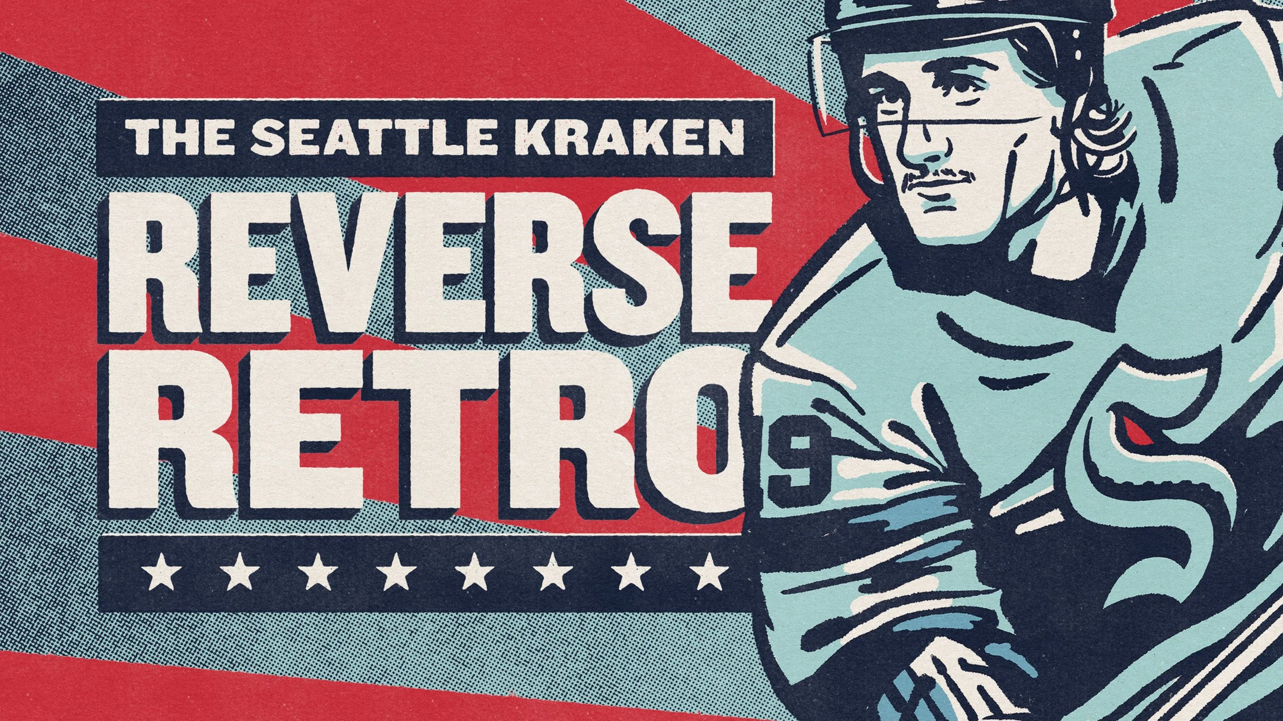
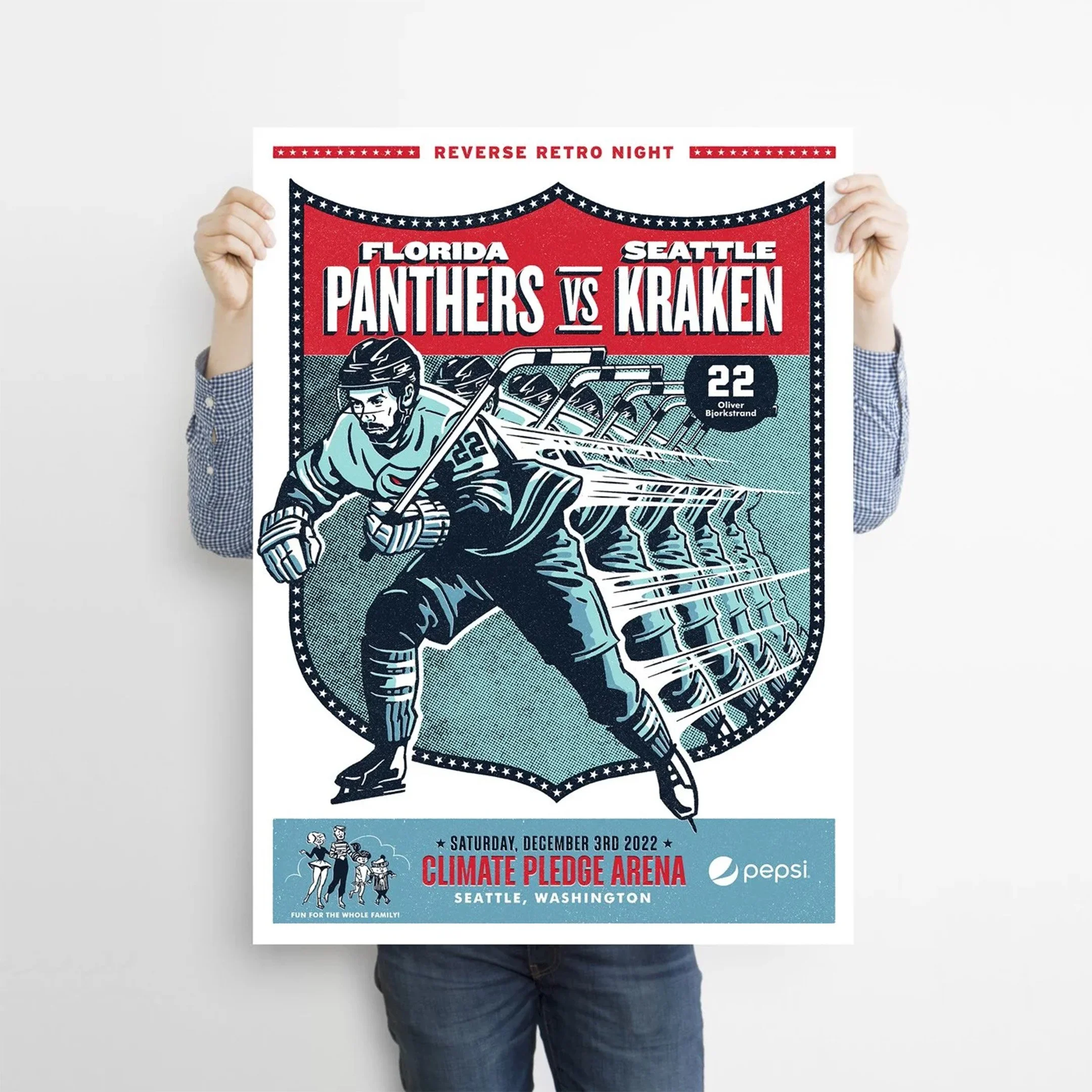
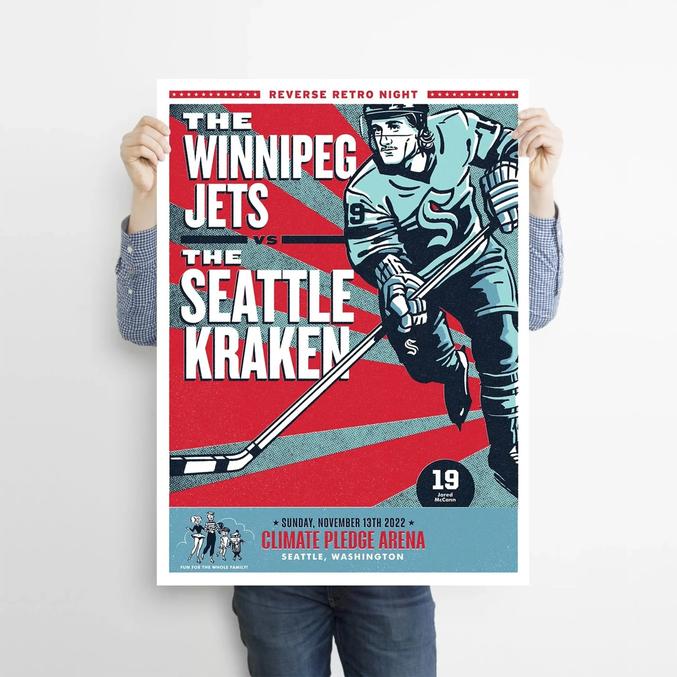
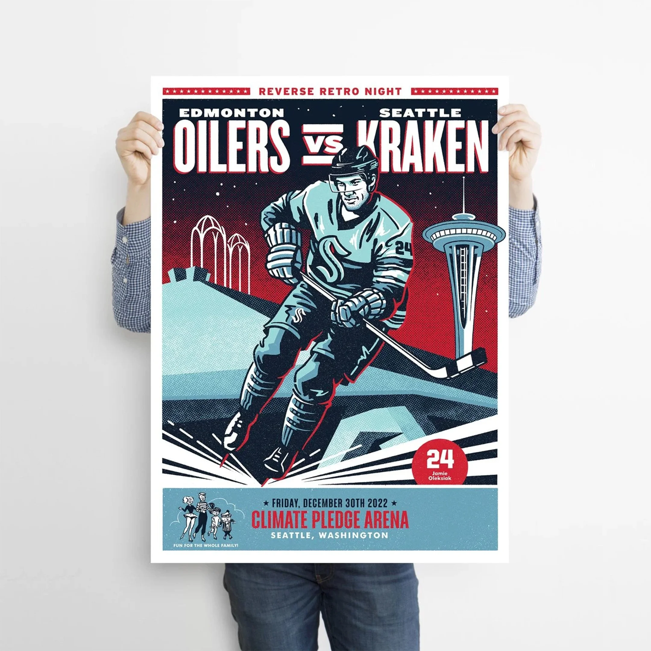
Each season, the Seattle Kraken take the ice in a dedicated “Reverse Retro” series, an ongoing tribute to the city’s historic Seattle Ironmen team.
While the jerseys remain consistent year to year, the surrounding campaign offers an opportunity to reinterpret and reintroduce that legacy to fans in a fresh way.
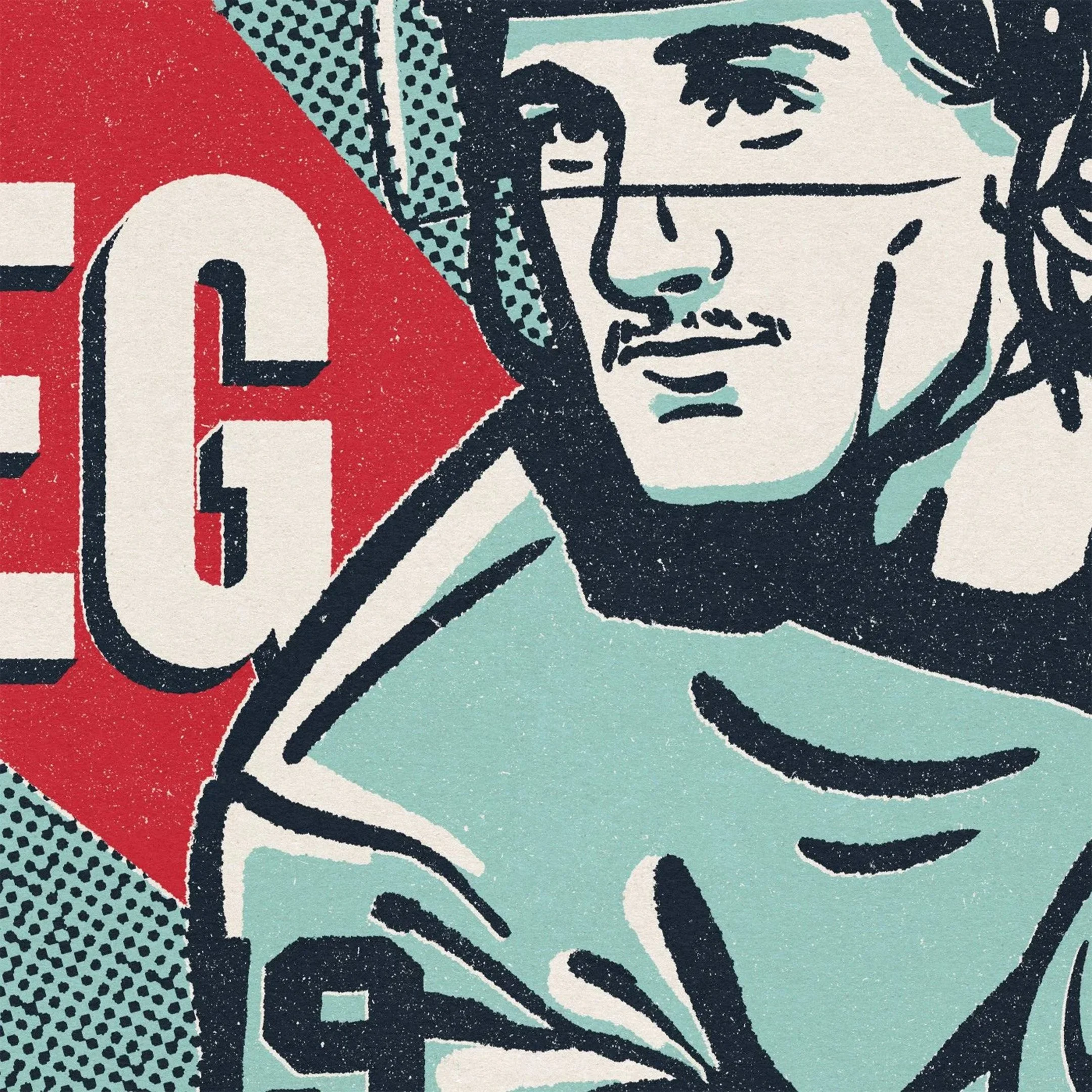
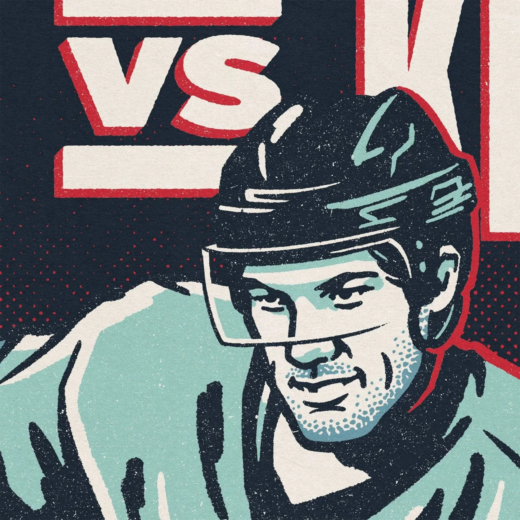
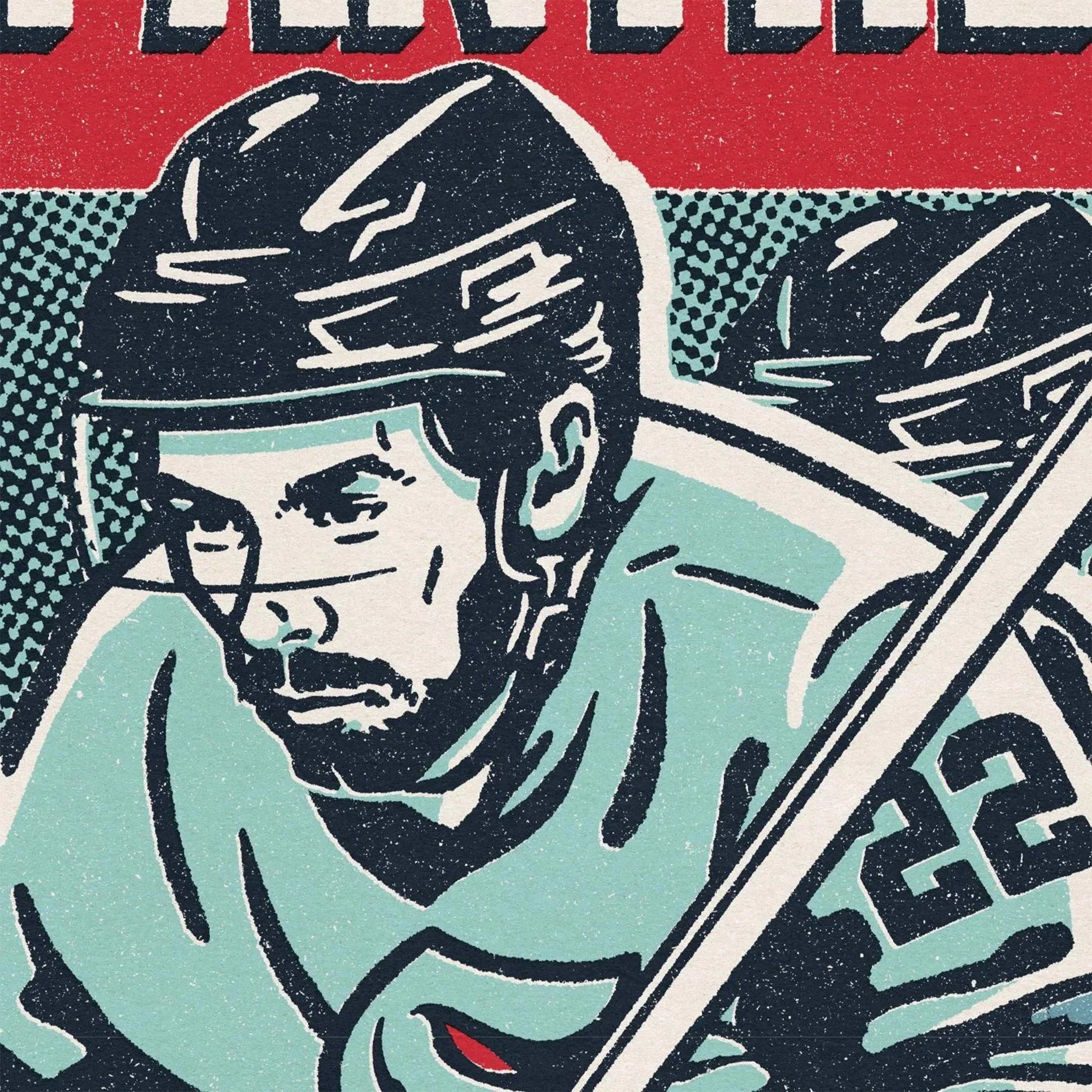
For this iteration, we developed a series of four illustrated posters inspired by WWII-era graphics, drawing from the visual language of wartime propaganda and industrial printmaking. The goal was to create artwork that felt historically grounded while still resonating within a modern arena environment.
Each poster was tied to a specific game in the series and distributed to fans in-arena, extending the experience beyond the uniform into something collectible and immersive. The visuals were also carried throughout the arena and promotional materials, creating a cohesive campaign presence across all touchpoints.
The result is a system that reinforces the Ironmen legacy year after year, giving fans a new way to engage with a familiar story while strengthening the connection between the team, the city, and its history.