CLIENT:
SEAPINE BREWING COMPANY
Roles:
• Brand Identity
• Packaging System Design
• Illustration
• Custom Typography
• Icon Design
• Production Development
• Project Management
Creative Direction:
51 Eggs Branding
PROJECT:
Identity Design & Packaging Development
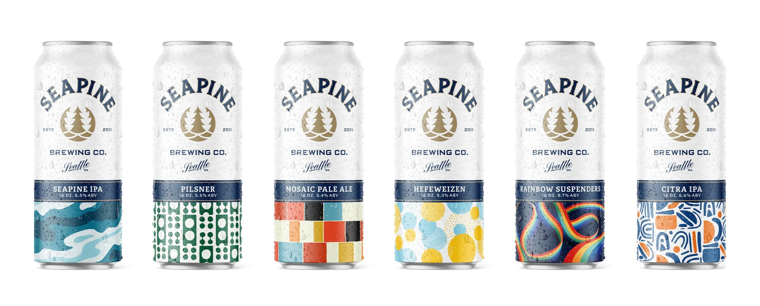
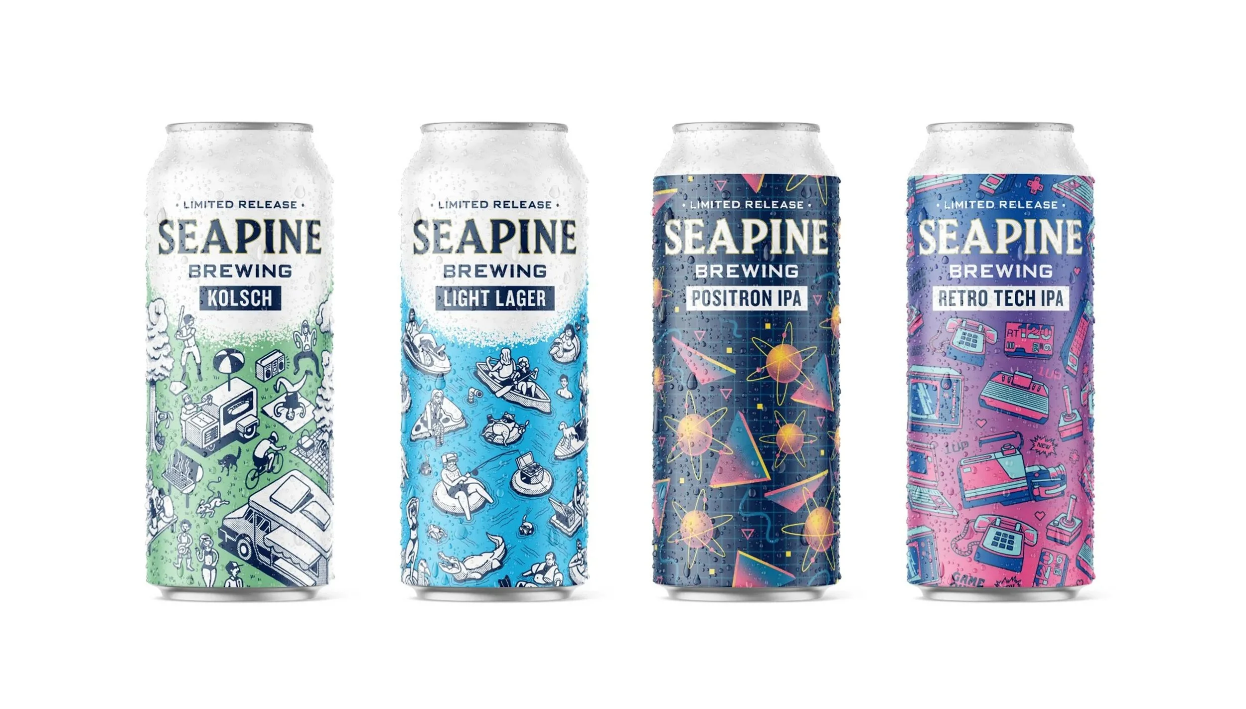
Seapine Brewing Company engaged a full brand identity and packaging redesign, centered on creating a cohesive system for craft beer cans and seasonal releases. The project focused on brewery branding, beer packaging design, and scalable visual systems for a growing product lineup.
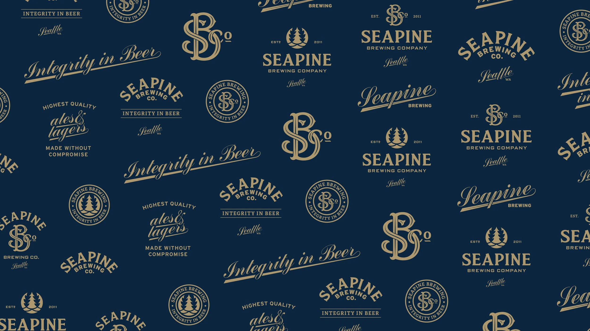
The identity was built around a flexible framework that balances consistency with variation, allowing individual beers to stand apart while remaining clearly part of the Seapine brand. Core design elements establish a strong foundation across all touchpoints.
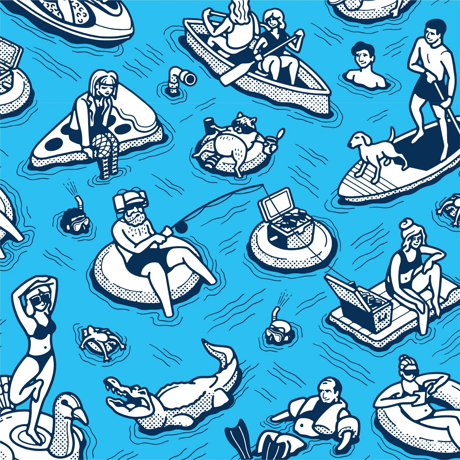
Custom illustration plays a central role in the system, with a series of patterns developed to bring character and distinction to each release. These patterns function both as individual expressions and as part of a unified visual language across the full lineup.
The packaging system extends across standard and seasonal releases, supporting a wide range of products while maintaining clarity and shelf presence. Each can is designed to feel distinct, yet unmistakably connected to the broader brand.
The result is a cohesive brewery branding and beer packaging system that strengthens brand recognition, supports product expansion, and creates a visually engaging and flexible identity across all formats.